Newspapers have been around for centuries, so clearly they idea of printed words on a page carries some longevity. And hopefully, so does your website. One of the most important factors determining how long a viewer will stay on your website…the ease or readability.
A website can be pretty – with the most stunning modern fonts – but if it isn’t easy to read, you’re losing viewers before they even get the chance to dive into your content. As much as it pains me to say, because I love pretty things, in this case, function trumps design.
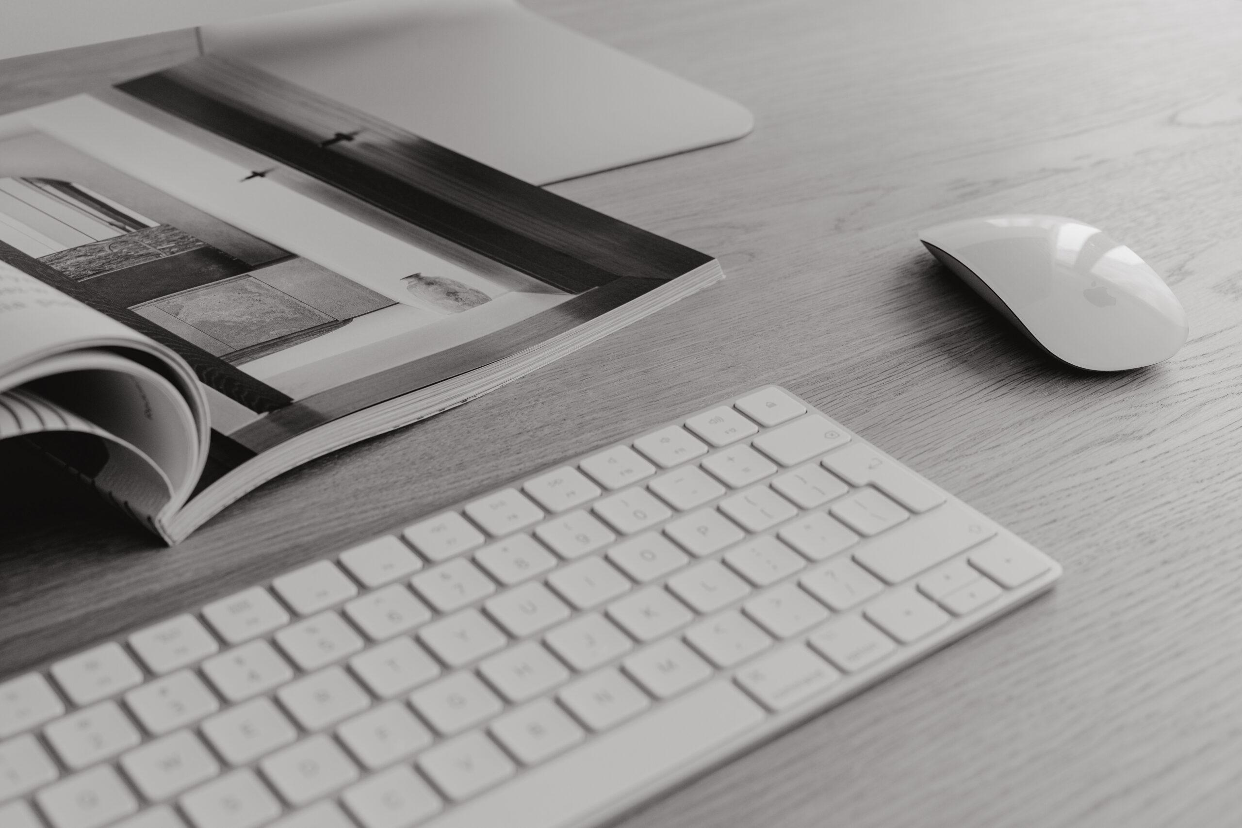
We all grew up watching our parents read the newspaper (well, maybe not the younger generation, but the rest of us did!) and it never dawned on me until I became a designer how strategically designed a newspaper is. Here’s a few key points that stick out – and they can be applied to your website design as well:
Font choice
Times New Roman is statistically one of the easiest to read fonts. Not all newspapers use that exact font, but they use something similar. Serif typefaces have historically been credited with increasing both the readability and reading speed of long passages of text because they help the eye travel across a line, especially if lines are long or have relatively open word spacing (as with some justified type).
The size of your font, and the spacing between the letters play an important part in readability as well. Too much space between the letters can slow down reading, and too little space can wreak havoc on the viewers eyes. When in doubt, keep it set to zero. (And please for the love of god, keep the spacing between letters to zero if you’re using a script font!)
Larger, bold headings in a *slightly* different font.
When you look at a newspaper, the titles/headings are much larger to read than the article text itself – they know people will be skimming each page before they decide what they want to read and what they want to ignore (no matter what…people are going to skim your website. Don’t just assume that they’ll read every bit of text, in order, from top to bottom.)
They put the most interesting information first, on the front page.
This is pretty self explanatory, and a little similar to the last point I made. You don’t see newspapers hiding their most interesting articles in the middle of the paper. They are front and center, for all to see. For all to *buy.* Put your best work on the home page. Put your most interesting, emotive work on the home page. Make sure you state who you are, what you do, and what makes you different on the home page (and preferably at the top, so it’s seen before viewers have to scroll! This is similar to the *above the fold* concept with newspapers, where the eye catching articles are on the top half, before the fold in the page.)
Articles don’t span the entire width of the page, from left to right.
This might be ok in a book….but think about the size of the page of a book. It’s narrow. A newspaper is much wider. You never see a newspaper article that spans the entire width of the page. Can you imagine your head having to turn from side to side every time you make it to the next line as you’re reading? Can you imaging how long that would take to read? Can you imaging how annoying that would be to read? The same holds true with a website. Now that HUGE computer monitors are standard for many viewers, you should never let your website text span the entire width of the screen. It’s very difficult on the eyes, very easy to lose your place, and again, just plain annoying. You can break your text up into multiple columns (like in a newspaper), or consider adding images to break things up.
The words don’t extend to the edge of the page.
One of my *biggest* pet peeves is when websites have text that goes all the way to the edge of the page. Or when it butts up to the edge of a photo. Leave some breathing room between elements! This again puts strain on the eyes and creates stress in the viewers mind. Repeat after me….breathing room! As a rule of thumb, I always leave at least 100px between elements (unless they’re overlapping) and keep text no less than 100px from the edge of the page.
There’s SO many more, I could go on for days. And don’t get me started on magazines, too! Believe me, everything is *strategically* designed (and they’ve had centuries to perfect it) to maximize readability and user experience. If in doubt, pick one up and check it out yourself!