


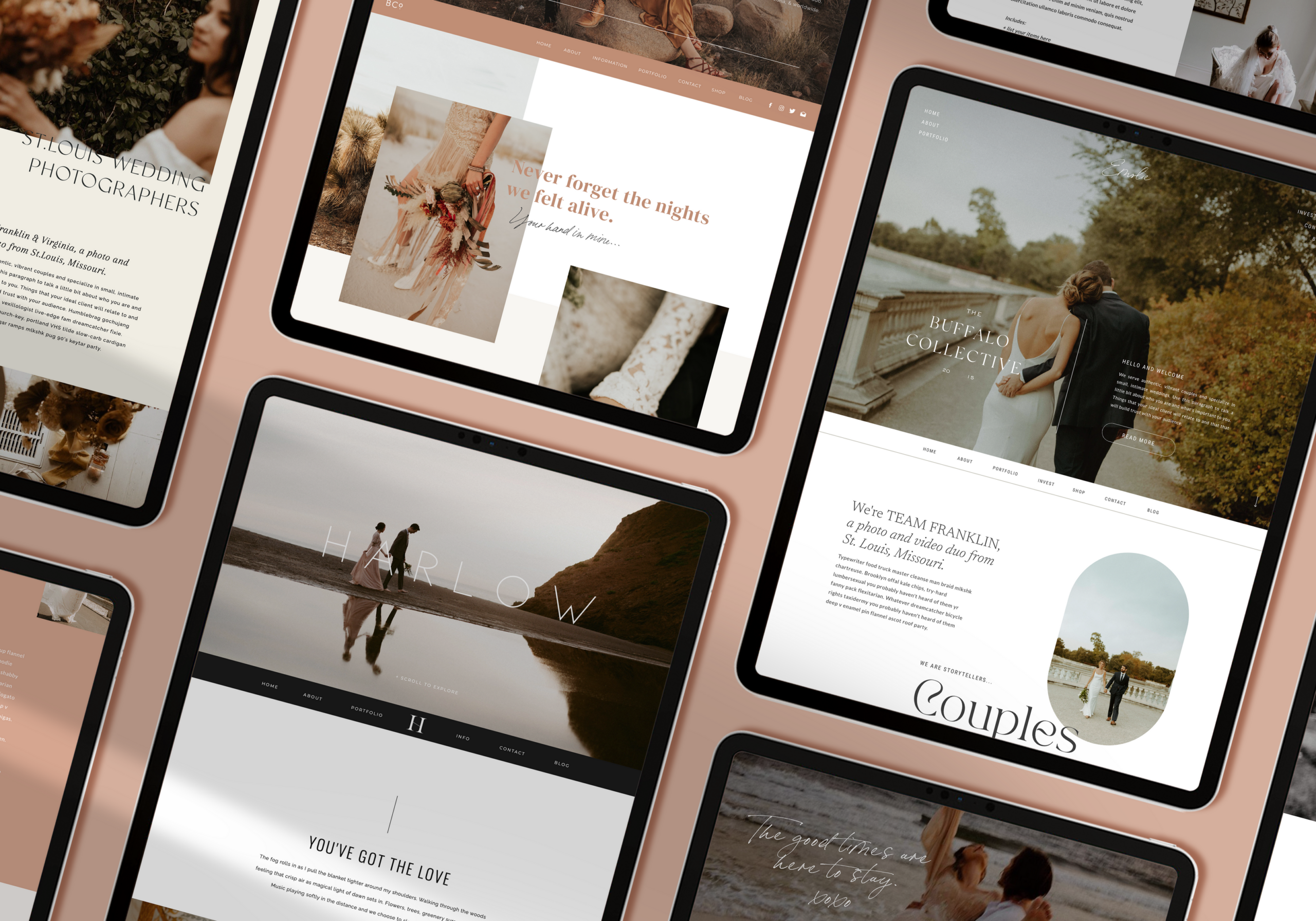
Over the past ten years I’ve sold HUNDREDS of Showit website templates, and believe me I’ve seen my fair share of poorly executed customizations out there. Over time I realized that all of the “bad” ones I’ve been seeing share many things in common…here’s the 5 most common mistakes I see!
Not telling people where you’re located.
Your location should be mentioned multiple times on the website (especially if you’re a service based business!)
Crowding the template with additional text and placing content where it’s not meant to go.
Most templates out there were strategically designed to be read a certain way and to keep people moving through the site. Rather than adding new text boxes where they don’t belong, consider duplicating an existing canvas instead!
Not optimizing the site for SEO.
There’s SO many ways you can do this on your own with Showit! If you visit their help library there’s multiple articles about naming your files, file size, H tags, page titles, and meta descriptions.
Trying to reinvent the wheel.
By all means make it unique to you, but if you’re tearing it apart trying to change every little detail, you’re pretty much starting from scratch all over again.
Putting a ton of time into the desktop version but having a messy mobile site.
The amazing thing about Showit is that you can design the mobile and desktop versions separately – giving you FULL control over how the mobile site looks. Take advantage of it!!
New to Showit?
Interested in taking it for a spin? You can try either of our FREE Showit website templates, Ferncroft or Beau Fleuve, available directly in the Showit app! You can access it by signing up for a FREE 14 day trial to Showit here! Then, once you’re done with the 14 day free trial, you can get one FREE MONTH when you sign up and pay for your subscription HERE!


")

Hi. I purchased the Franklin template. Do I need to :You will need to generate your Showit theme before you can begin using it.
When I click this in wordpress it says, Unable to retrieve published theme generator. I wasn’t sure what all the template included as far as a blog. Any help is appreciated. Thank you!
Hi!! Can you please email about this at thebuffalocollective@gmail.com