A logo is not one stand alone object. It is part of a larger whole, one piece that works along with your other visuals to create one cohesive brand. Logo design is almost like a mini branding package in itself. We offer three designs as part of logo design packages, because we know your needs are never “one size fits all.” Sometimes you need a detailed version, sometimes you need a simple one, sometimes you need a square one rather than rectangular, etc. When you have three, you have all your bases covered. Here’s what we include:
Primary Logo
The primary logo is the most detailed, contains the most information, and is the design you will use to represent your brand unless something simpler is required.
Logo Variation/Secondary Logo
The logo variation is a simplified version of your primary logo. It may contain less information, fewer details, and be oriented/arranged differently than your main logo.
Submark
The submark design is the simplest form of your logo. It may be reduced to just a letter, shape, or icon. This design is great for social media profile pictures, favicons, watermarks, or as a monogram.
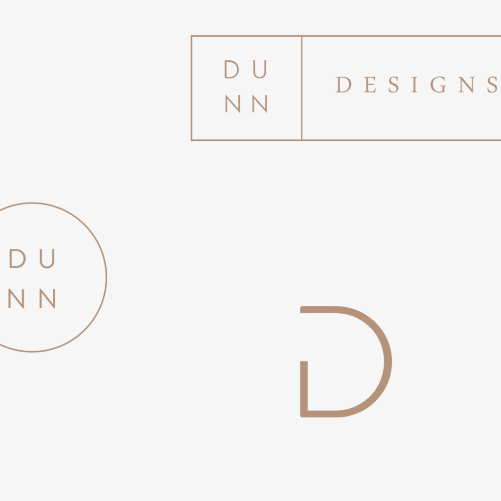
Here’s another example:
Notice how the top logo (primary) shows the full business name. It is the largest, most detailed (although still extremely minimal, that’s my style!), and gives all of the necessary information the viewer needs to see.
The middle logo (variatin/secondary logo) is a slightly more simplified version of the primary logo – the word “designs” has been removed and the rectangle has been reduced to a circle. Because it is square/circular in shape, this version is better suited for social media profile photos or anywhere an “icon” is needed.
The bottom design (submark) is the logo in its simplest form. Short, concise, to the point. As minimal as it gets.