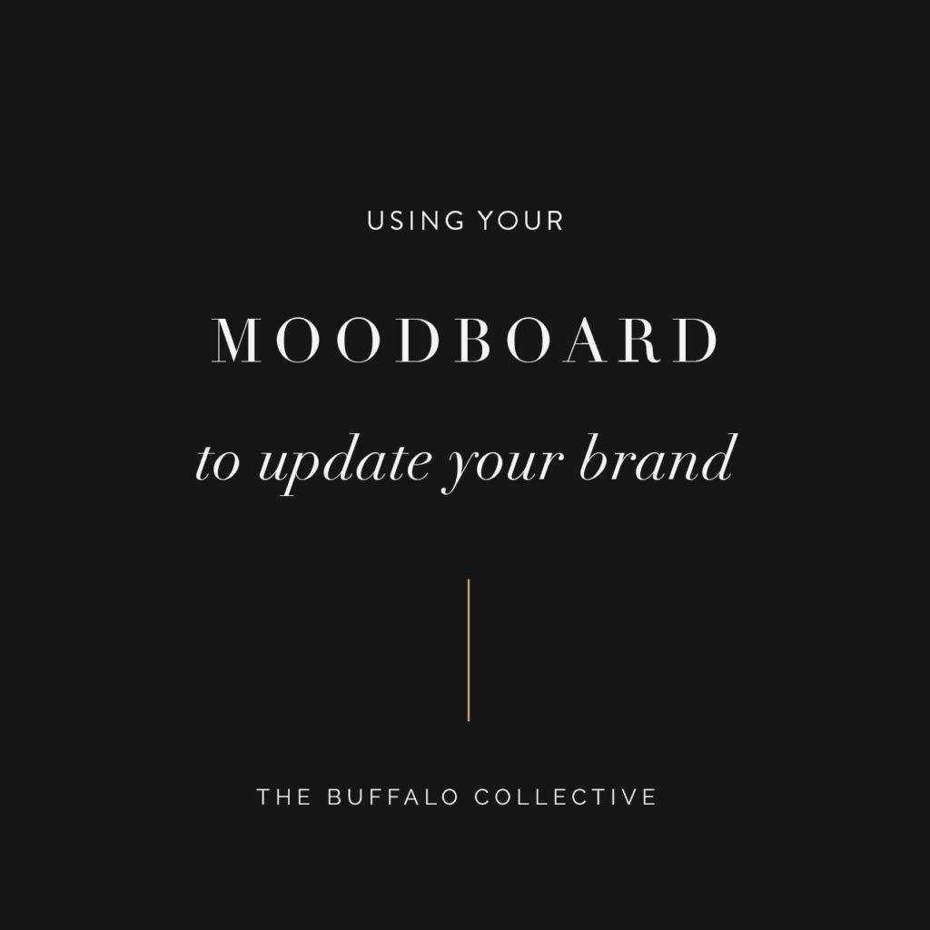
Creating a moodboard is always our first step in the branding/rebranding process. It’s the most important, but it’s also the most overlooked. Our main objective is to narrow down the overall “look and feel” of the brand. The moodboard serves the same purpose as a mission statement- it helps you keep your end goal in mind, and helps keep you on the right track to get there. As your business evolves, it’s important to have a reference point to look back on to make sure any visual materials match the core values of your brand as well as maintain a cohesive style that’s consistent with what you’ve already shown to the world.
All brands can and should evolve.
Abby Anderson, one of our first clients to put her faith in me way back in 2015, was kind enough to share some updates she made to her original moodboard on one of her recent instagram stories. She explained that as her brand grows and becomes more refined (as all brands can and should do!) she uses this updated moodboard as a guideline for the new visuals, marketing materials, and work she puts out for the upcoming year. I reached out to Abby and asked her to write a guest blog post about the topic as well. This will be the first of many guest blog posts of 2018…enjoy!
It’s hard to believe that it’s been two entire years since I collaborated with The Buffalo Collective to design the brand for my photography business. Together we launched a dramatic, romantic, sun-drenched brand with a hand lettered logo (Christina’s genius!) that has propelled my business forward in so many ways.
It’s fun to choose colors, patterns and fonts when you’re initially creating a brand but it’s impossible to know in perfect detail how those choices will play out as you source printed materials and packaging elements. As you live with the brand you’ll discover ways you can improve and streamline your look.
Over the last two years I’ve reached a point of greater clarity, intention and confidence in what I want communicate to my clients and decided to make a few minor changes.
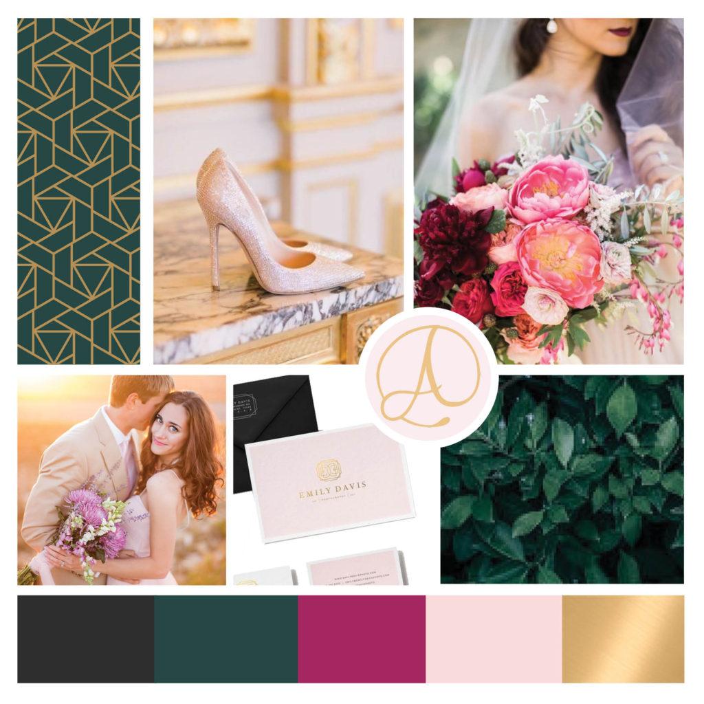
I started with the mood board, which is the “at-a-glance guide” for your brand. My clients don’t regularly see this board, but it holds my color palette and helps guide my decision making when it comes to colors and overall look and feel.
Here is a side by side of the old and new mood board.
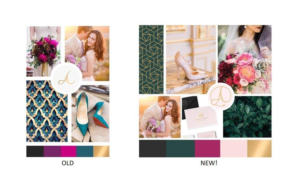
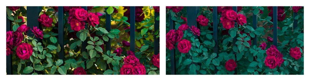
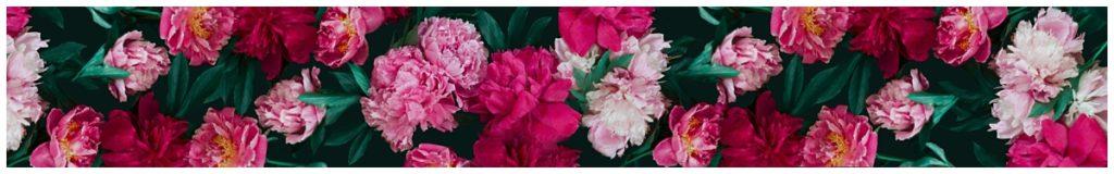
Take a look at my old color palette. Somehow I found that I was gravitating toward using only gray, gold and white. I love color but was veering away from using them because the teal was clashing with the primary green tone in my floral pattern. (see below)
To improve this, I deepened the teal to a blue-ish emerald tone and color adjusted the greens of the floral pattern to match. My clients will never notice this change but it looks so much better!
The pink / purple colors were another struggle. I loved both colors but neither one translated quite right in day-to-day use. To fix this, I unified them into one deep berry color that also matched the blooms in the floral pattern.
In place of the missing pink, I added a blush color. It pairs well with the dramatic tones, feels “bridal” and helps soften everything.
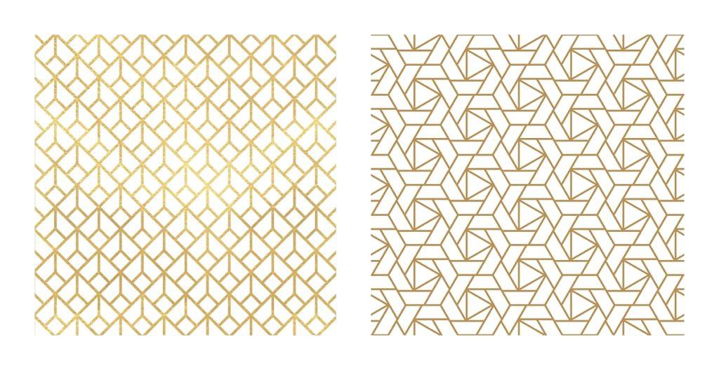
The Art Deco inspired gold pattern I originally chose was quite angular. I decided to switch it to something with a hint of circular motion, again, to soften the brand. The new pattern almost has a “rose” pattern if you squint your eyes at it!
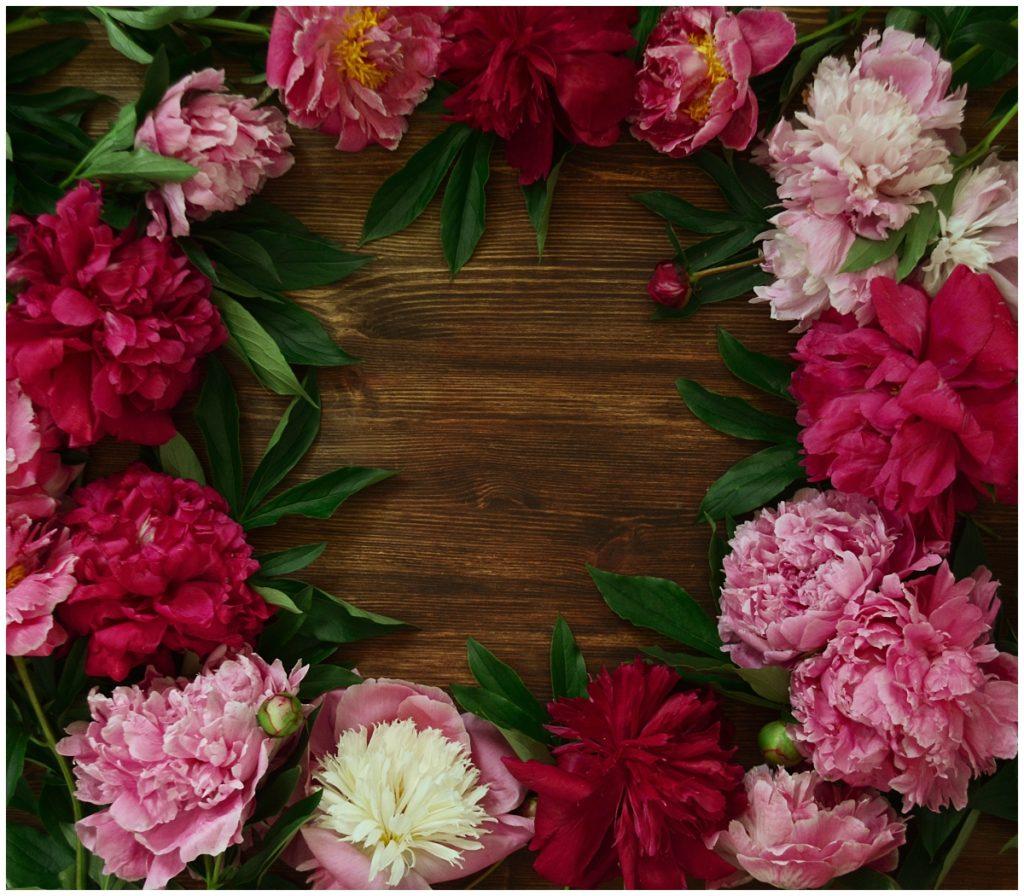
To further enhance my packaging possibilities, I created a second floral pattern that could be printed on cardstock and used as a narrow “band” around boxes. It has less greenery and more concentrated color. After literally three hours of searching (oh, my eyeballs!) I found a stock image that would work. I cut and spliced it (with the help of some photoshop handy friends) and then color adjusted to create this.
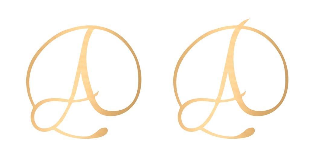
My monogram is so pretty and I use it on a lot of things. The only thing I tweaked here was to remove the top swoosh of the A. Merely a personal preference.
Here is my completed, updated mood board for 2018!
Don’t be afraid to make changes as your business grows! Stay consistent and true to your original vision but with updates that WORK for you.
xoxo! Abby